In the late 2000s, studies indicated that users browsing the internet would soon migrate to smartphones over desktops or laptops. Sure enough, over the years more and more companies and website owners started approaching designers for extra layouts of their websites, that would fit the smaller viewports of iPhone and Android devices.
The question naturally arose — would different layouts need to be made with the release of each new device? If not, could the approach used to build a website…be used to build an app?
In 2010, Ethan Marcotte — an independent web designer from Boston, USA — wrote an article on a new approach to make web development future-proof, in an article called “Responsive Web Design”.
In his article, Marcotte talks about the inspiration behind responsive web design, and it surprised even us — ‘Responsive Architecture’. A topic frankly too fascinating to not explore (and one that took us deep down a rabbit hole), he explained how art installations like an Emotive Wall, Smartglass and more, create spaces that adjust to accommodate the people within them:
“An emergent discipline called “responsive architecture” has begun asking how physical spaces can respond to the presence of people passing through them. Through a combination of embedded robotics and tensile materials, architects are experimenting with art installations and wall structures that bend, flex, and expand as crowds approach them. Motion sensors can be paired with climate control systems to adjust a room’s temperature and ambient lighting as it fills with people. Companies have already produced “smart glass technology” that can automatically become opaque when a room’s occupants reach a certain density threshold, giving them an additional layer of privacy.”
What started off as a piece in ‘A List Apart’, evolved into a movement that kickstarted a mobile first approach in designing for websites.
Since its inception, Responsive Design has evolved drastically. Adding ‘responsiveness’ is now an integral part of building any digital product, and needs the involvement of both designers and developers to decide how and when the layout and content need to adapt.
It also plays an extremely important role customers have a great experience when using products across devices. If you were to grab the corner of your screen right now and pull it up, down and diagonally, you would see the text adjust to fit the size of the screen without losing things like clarity or cutting off half the screen. It’s also the reason you can binge Netflix on your Laptop, Smartphone or iPad and have a great time either way!
Today, Android supports 30,000+ devices that come in all shapes and sizes. The screen rotation and split screen features multiply the variety in dimensions that websites need to support. But Responsive Web Design today is more than just adjustable screens and automatic resizing of images. It’s also about expanding the way we think about design and opens avenues previously discounted.
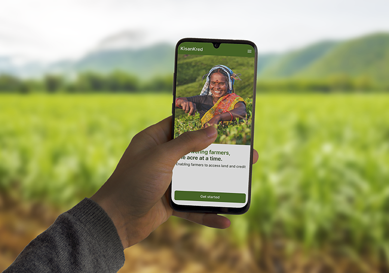
Over the last few years, we have slowly and steadily been learning more and more about responsive design and concepts like screen metrics, flex boxes, layouts and more are pieces of our education that we add to the repository every day. Working with clients working for social change in different parts of India, we found that devices being used by rural users ranged from early 2015 models with Android 5.1 and 4.7inch screens to the latest 2020 models with Android 11 and 7 inch screens. To adapt our design to this bizarre amount of devices and its features, learning about Responsive design was the key.
Over the next few weeks, we want to share that knowledge with you — what it takes to ensure a positive user experience and to include responsiveness in UI design.
Be sure to join us and don’t forget, play around with your screens today and tell us if the pages you’re viewing are responsive or not!