Seclore is a California-based company that specialises in data protection technology. In sectors such as banking, finance and insurance, where sensitive data is constantly exchanged both internally and with third parties, the ability to track the movement of files and manage access to them is critical. Seclore ensures organisations can effectively control usage of sensitive information through a browser-based platform that offers automated file protection and secure external collaboration.
While the existing platform’s interface was functional, there was an opportunity to organise the information so that relevant details could be accessed quickly and easily. We designed a user-friendly dashboard concept that structured the vast amounts of information into sub-sections and introduced graphics, charts and trackers to present data in a much more visual manner.
Expertise
- Systems Thinking
- UX/UI Design
- User Research
- Branding
OUTCOMES
- Improved usability of the product
- Customisable dashboard for data management
- UI guidelines and individual screens (Windows, Mac, Android and iOS) for the entire product flow
APPROACH
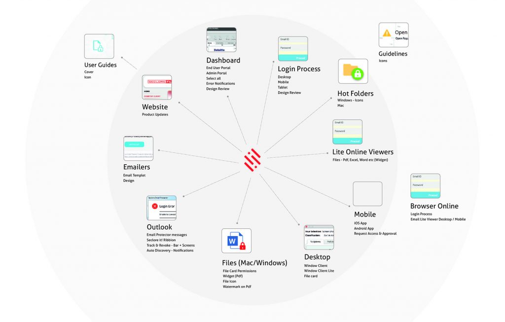
We began by looking at the big picture of the product ecosystem to get a deeper understanding of the entry points and exits of each user story. Our first step was to draw the entire Seclore platform so that we had a complete view of every possible interaction, step and outcome. We mapped out all the product flows, ranging from small actions like clicking on the Help button, to accessing a full history of users who had opened a particular file. We then created a large-scale printed version of this ‘exploded view’. This exercise helped align the internal team about the minutiae of how the product worked. More importantly, it allowed us to prioritise which epics (a series of user flows) to take up first.
The platform had to be designed for two types of users:
Security Officers: Tasked with monitoring licences and permissions, granting/revoking permissions and access to files and helping users resolve any issues with the system
Protector/User: Monitor file usage and receive alerts when security incidents occur
It offered many types of security features, from sharing files, managing printing, copying and downloading rights, and more. There were also integrations with other software, such as email systems and Microsoft 365 for document creation and editing. Understandably, protecting data end-to-end is extremely complicated, with many loopholes. Seclore was solving for this by owning the entire ‘security stack’ – Which meant it was capable of protecting any format of document, restricting copy/paste functions and even controlling screen captures. Once we grasped the product’s complexity, we could then explore how to transform it into a much more intuitive user experience.
Our analysis helped us write all the possible user stories and epics that the product would need to solve for. We also conducted card sorting exercises to understand how to categorise various file permissions. Once we had these in place along with a UX strategy, we began designing the UI.
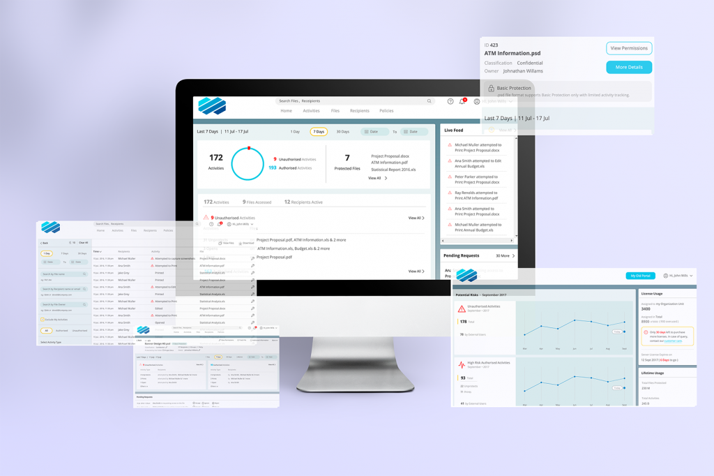
We took visual cues from stock market tickers, and trading screens. These formats convey a lot of detailed information by using symbols, graphics and charts. We created a live feed so that users could track files in real time and proposed several features designed to turn the dashboard into an indispensable resource for protecting and managing files.
Once the architecture had been created, we designed screens, templates and brand guidelines so that the dashboard could be customised with Seclore’s customers’ branding including logos and colours.