Mathematica is a leading provider of evidence-based research, data analysis, and evaluation services that help organisations across sectors to assess the effectiveness of policies, programs and initiatives. Mathematica engaged with AGRA, a non-profit organisation to develop a data dashboard that would allow leadership to track the progress of agrarian transformation across various African countries. Mathematica approached us to help design the dashboard for AGRA.
The goal was to take complex datasets—pulled from multiple sources—and turn them into a tool that would help leadership track progress, identify gaps, and make informed decisions. AGRA program staff, ranging from country directors to VPs, would use this data to assess progress and understand variations by country, crop, and other factors during quarterly management and annual strategic planning meetings. They needed a team that could transform a vast dataset into an intuitive, user-friendly experience that made decision-making seamless.
EXPERTISE
- User Research
- Systems Thinking
- UX & UI Design
- Rapid User Testing
OUTCOMES
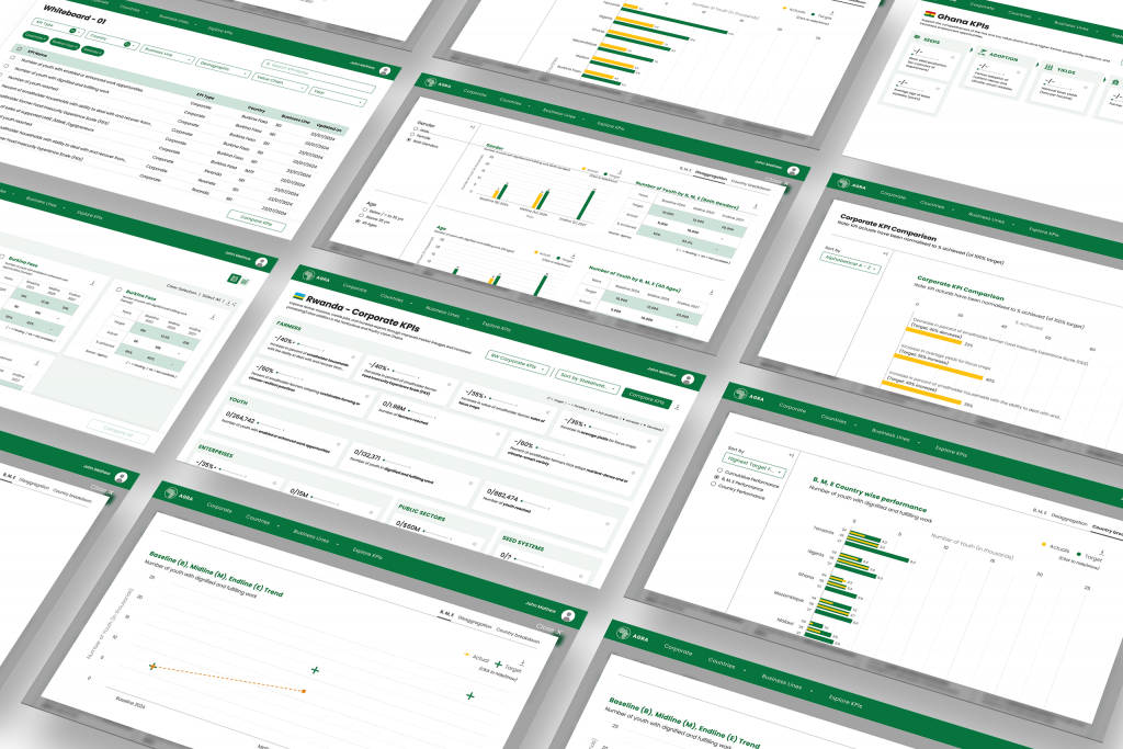
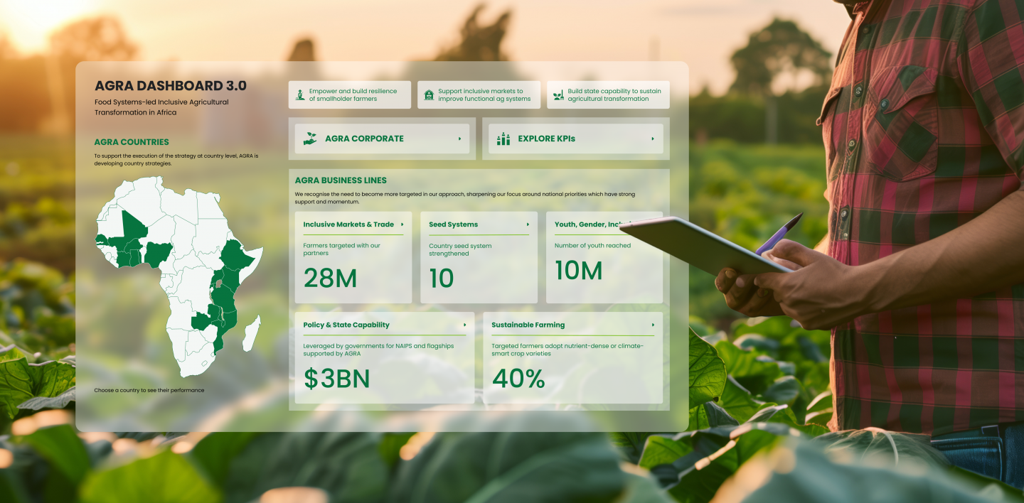
- Design of an Interactive Dashboard: A user-friendly platform for tracking progress, identifying gaps, and assessing policy effectiveness.
- Clickable Prototypes: Interactive demos to showcase the dashboard’s capabilities to stakeholders.
- UI Kit: A design system ensuring brand consistency across digital tools.
APPROACH
The biggest challenge was the inherently complex dataset, with multiple variables influencing outcomes across different regions and time periods. And so before diving into design, we focused on research. We interviewed key stakeholders to understand how they would use the dashboard—what questions they needed answered, what challenges they faced with data, and how they envisioned the tool fitting into their workflow. A few key insights emerged:
- Simplicity was crucial. Users needed a dashboard that provided at-a-glance insights without overwhelming them with data.
- Customisation mattered. Different teams had different needs, so the dashboard had to allow users to tailor their views.
- Comparisons were key. Leadership wanted to track progress across different countries, crops, and other variables.
We knew that for leadership to extract real value from the dashboard, data needed to not just be visually appealing, but also functionally effective. We evaluated and explored various types of graphs and data visualisation options to determine which would best support understanding data. Each visualisation was carefully assessed for its ability to present information clearly, enable easy comparisons across regions and time periods, and allow for quick trend detection.
Visualisations also needed interactivity—with features like filters, drill-downs, and hover-to-reveal tooltips—so users could customise the view to focus on specific metrics, enhancing both exploration and understanding. The final choices reflected consistency in colour usage, navigation, and visual hierarchy, ensuring the product’s overall functionality was seamless and cohesive.

Our design approach focused on creating a dashboard that was both scalable and intuitive, ensuring users could navigate data effortlessly while accommodating future growth. Here’s how we made it happen:
- Flexible Layout: A modular, scalable framework that could accommodate future data additions without a full redesign.
- Micro Visualisations: Small, glanceable charts allowed users to see trends quickly, while interactive filters and drill-downs let them explore further.
- User-Friendly Navigation: Users could move between sections seamlessly, always understanding where they were in the dashboard.
We worked closely with the development team to make sure our designs were not just visually effective but also feasible within the technical constraints. We iterated quickly, testing and refining components to strike the perfect balance between aesthetics, functionality, and performance.
The Final Outcome
By the end of the project, we had transformed a complex data challenge into a tool that was visually engaging, easy to use, and genuinely useful. The dashboard is slated to serve as a key decision-making tool for leadership, helping assess key initiatives with clarity and efficiency, supporting data-driven decision-making during key strategic meetings.
Building this product required close collaboration between multiple teams, spanning different geographies, languages, and time zones. Despite these differences, we worked together to refine the dashboard through structured feedback loops, iterative design sprints, and continuous validation with end-users. Design, in many ways, became the universal language that bridged all differences.
This project reinforced what we do best—taking complex problems, conducting deep research, and turning insights into design solutions that make an impact. It’s always rewarding to see our work go beyond aesthetics and truly help organisations make better decisions.
“BRND Studio showed up in a major way to help us design an interactive dashboard. They were practical, understood the work and aesthetic, and embraced complexity. They worked long hours to hit an aggressive timeline, leveraging time zone differences to move work along.”
Randall Blair
Principal Researcher, Mathematica


